Restructuring a 30+ product design system for one of India's largest financial platforms
Co-led the restructuring of a fragmented design system across 30+ products at Bajaj Finserv. 350+ components. 1,000+ tokens. Serving 100M+ customers.
Overview
Rebuilding the shared language for a company with 30+ products
Bajaj Finserv is India's largest non-banking financial services company, spanning six product ecosystems: lending, payments, insurance, investments, wallets, cards. Each product had its own designer, working independently, held together by one central design system. I moved internally from an agency into the Central Design System team, paired with a senior manager, in a team of two.
Impact
Single source of truth across 30+ products. Onboarding time for new designers reduced. Design consistency restored across ~100M customer touchpoints.

Problem
The system wasn't missing components. It was missing a reason to trust it.
When I joined, I was handed the design system and told to "go through it." I remember sitting there with no idea where to start. Different pages, different components, no explanation for what any of it was for. That confusion turned out to be exactly the problem I'd later be asked to fix.

Designers across the company were quietly avoiding the system and rebuilding screens from scratch.
Components got modified because they didn't fit real use cases.
There was no naming logic, no structure, nothing to explain how any of it connected.

Research
Understanding how twelve different design teams were actually working
Before changing anything, I needed to understand how people were really using, or avoiding, the system.

Two structural directions came out of that: Category led and experience led. Each had a real trade-off.

Decisions
Building a system that is flexible and scalable
Restructure, don't rebuild.
There were existing components, messy, inconsistent, but there. Rebuilding from a blank slate would have been cleaner in theory, but it would have stalled every product team waiting on it.

Choose structure based on evidence, not preference.
Rather than picking the direction I personally found cleaner, I mapped both structural options against what our actual users,
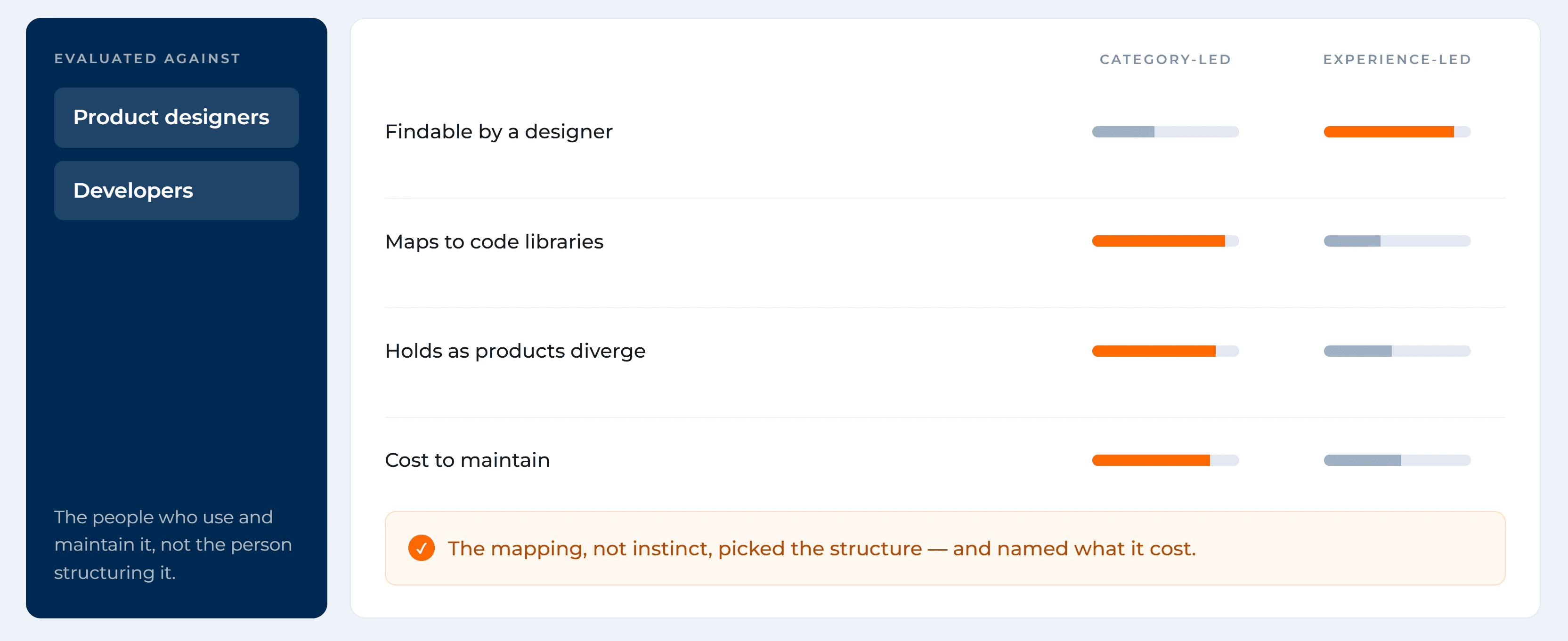
Involve developers before the first component, not after.
I started defining component architecture before I'd fully understood how engineering named and structured their own libraries. Partway through, I discovered they had their own conventions, H1, H2, body, image, tied to their code.

Build
Four stages: collect, organise, build, document
Collect. Gathered every unique component in use across 12+ product teams into one shared file, so we were working from what actually existed, not assumptions.
Organise. Segregated by type, removed duplicates, and identified genuine gaps, the components that were missing entirely, not just messy.
Build. Built master components with proper variants, Boolean logic, and design tokens, covering both mobile and web from the same foundation.
Document. Wrote a step-by-step onboarding guide and naming guidelines linked directly to the style guide, and kept an Excel tracker so anyone could see live visibility into what existed and what didn't.
Accessibility was built into the foundation from this stage, not added later, contrast ratios and legibility standards were part of every component's definition, so every product inherited accessible defaults by default.


Impact
The clearest sign it worked: designers stopped avoiding it
350+ components. 1,000+ tokens and variants. Naming conventions aligned to developer libraries, so handoff stopped requiring rework. A documentation and onboarding guide that meant a new designer, someone exactly like I'd been on day one, could actually understand what they were looking at.
The number I'm proudest of isn't the component count. It's that designers went from rebuilding from scratch to actually using the system again.