Redesigning how 200+ stores turn queues into orders
Redesigned the ordering UI for Chaayos self-order kiosks and POS system across 200+ outlets, contributed to
a 30% increase in order conversion

Overview
Helping users make decisions in pressured environments
Chaayos is one of India's largest tea retail brands with 200+ stores. I joined as a junior UI designer on a team that included UX, research, and branding, all working in parallel. My job was the interface: taking the UX team's flow and the branding team's visual kit, and turning both into something that actually worked at the counter, under real time pressure, across 200+ stores.
The Brief
"Get people to use customisation." Customers weren't engaging with it, and the brand wanted that fixed.
Customisation wasn't a UI problem. It was a queue problem. But you can't design a feature into adoption. If people aren't using it, something upstream is wrong. Customers were dealing with long queues, a confusing counter flow, and an interface that slowed down under rush-hour traffic.
Problems


Performing task on a single page

No clarity on clickable buttons

No consistency across the product

The real problem wasn't "how do we push customisation." It was "how do we make choosing feel instant."
Research
Watching how people actually ordered, not how the flow
assumed they would
People weren't confused about what they wanted.They were confused about how fast they could get through the screen in front of them. It was the number of steps between them and that choice.

Brand Kit
I then designed the design system for the product


Icons

Design System

Decisions
Building a flow that worked differently for a first order and a repeat one
1.
Progressive disclosure working along the cultural context and daily routine of 80% Indians
Under pressure, people can hold one decision in their head, not five. I broke the flow into single decisions shown one at a time,
instead of a full menu of options upfront.

2.
3D icons instead of text and use of Hinglish for the labels
Chai isn't a novel order, it's second nature. So the interface needed to match that familiarity. I used 3D icons of the actual drink being built, so people could recognise their usual order visually and move fast, instead of reading and processing text under time pressure.


3.
A different flow for repeat vs first-time customers.
The UX team had already brought the flow down from 7 steps to 4. My job was making sure the UI reflected two different needs inside that same flow: a repeat customer needed speed above all, a first-time customer needed just enough guidance without feeling slowed down.
Kiosk UI: First time user and second time user order flow
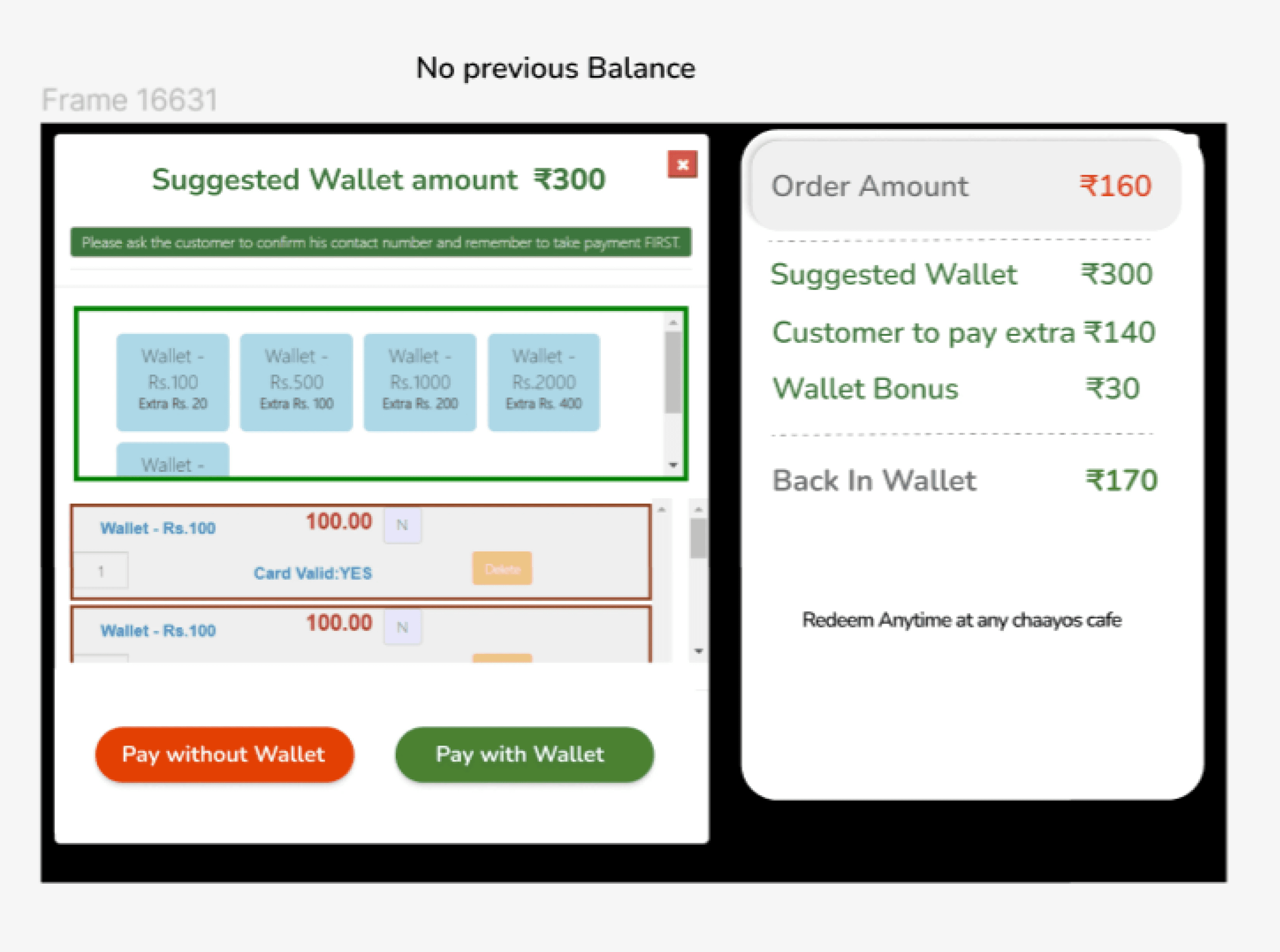
POS: User flow where the POS takes over their order
Impact